

For closer details, click on the small side by side squares.


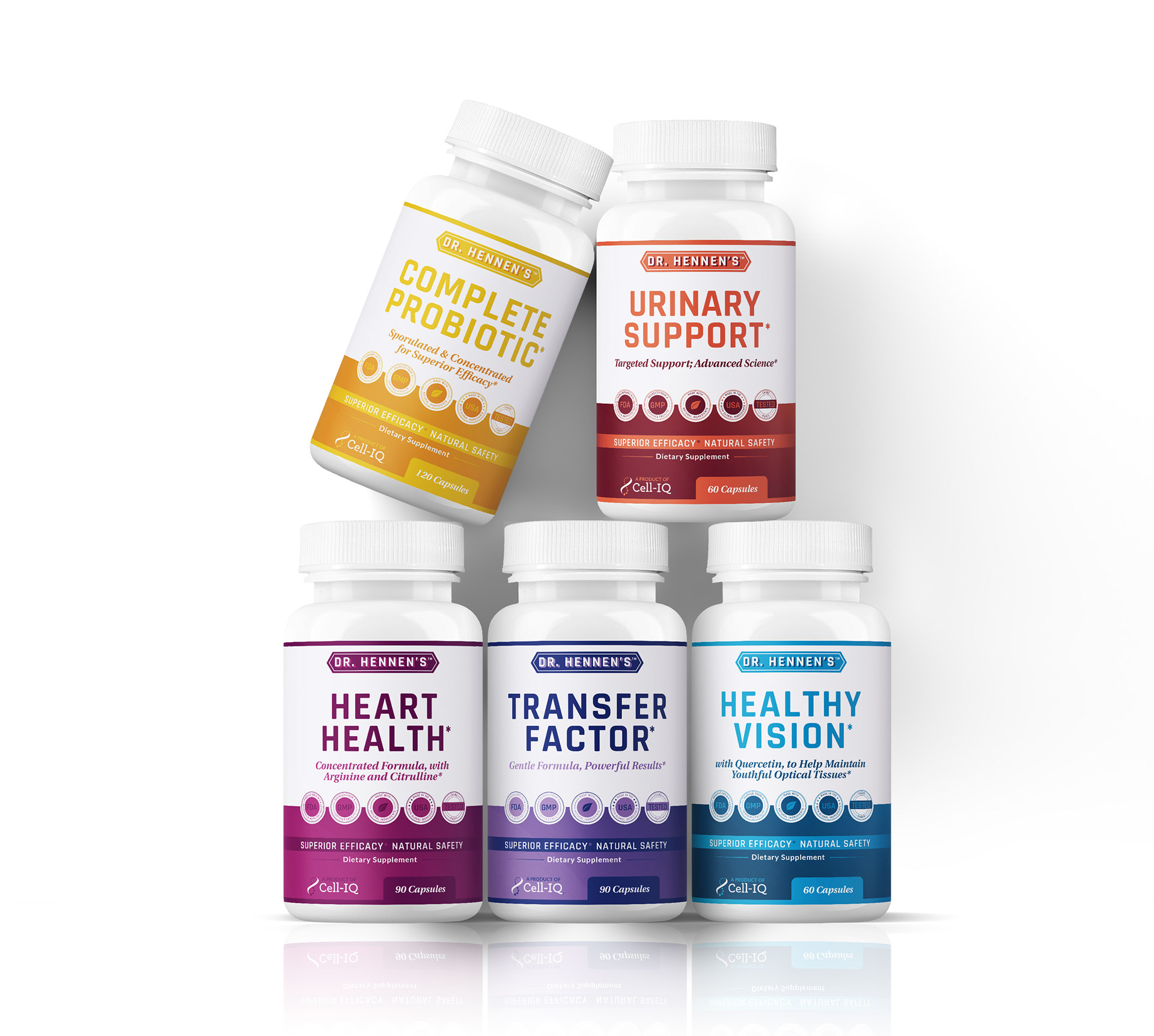
Dr. Hennen's Products II
2021 | client (Cell-IQ)
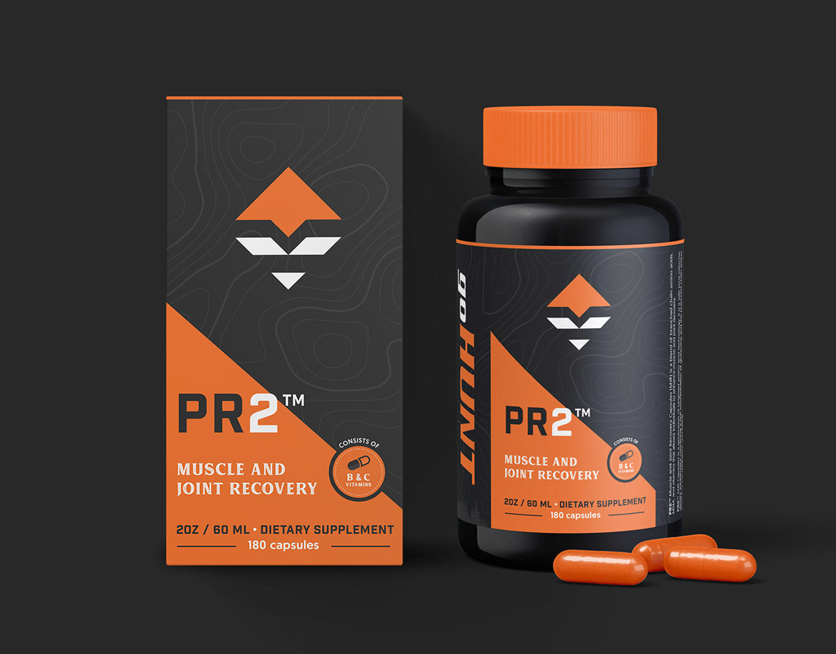
About: Cell-IQ (with products under the Dr. Hennen's name) is a group of people who have come together through a passion for creating natural products that make a difference, without compromise. With backgrounds in large global supplement companies and the drug industry, they have come together to do something unparalleled. 7 people, 3 Ph.D scientists, one heart, vast possibilities.
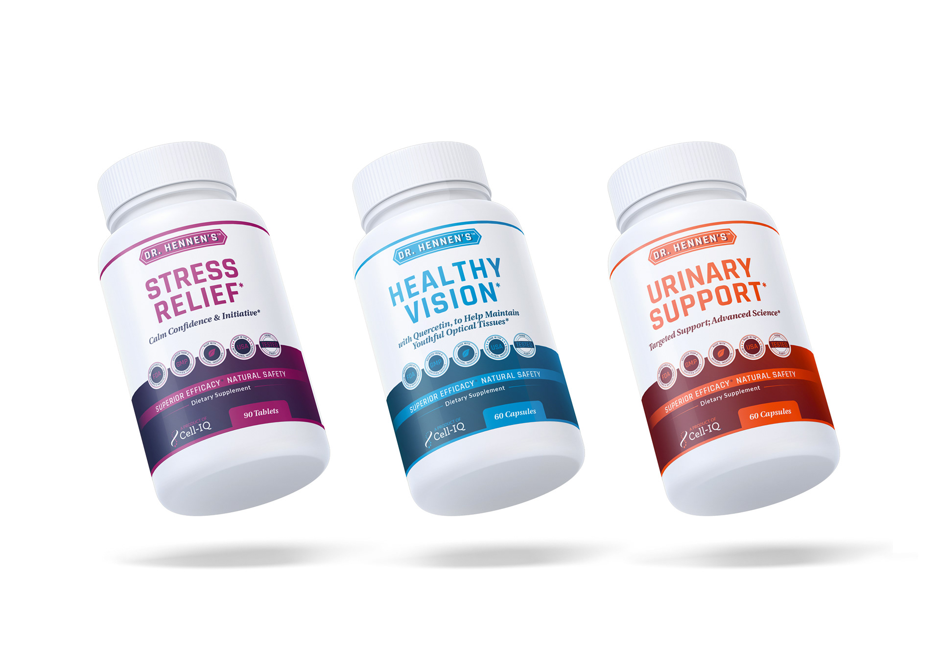
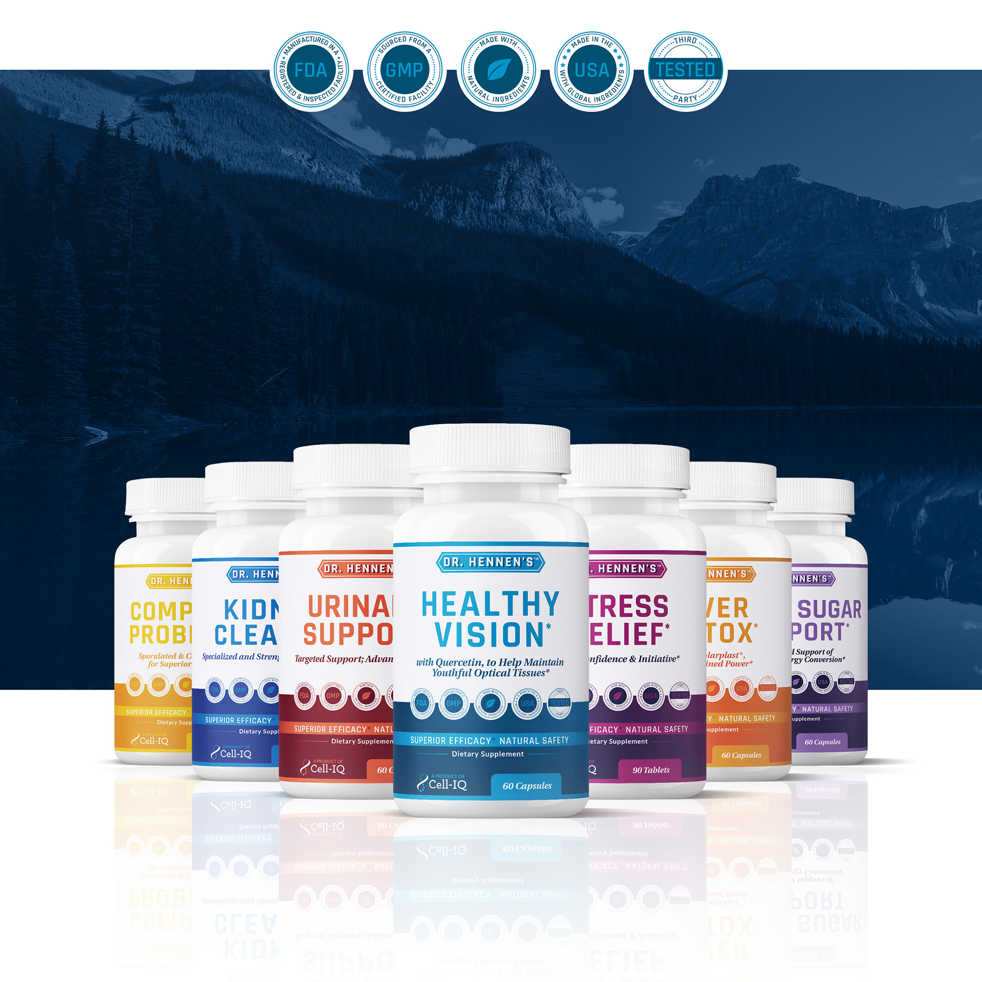
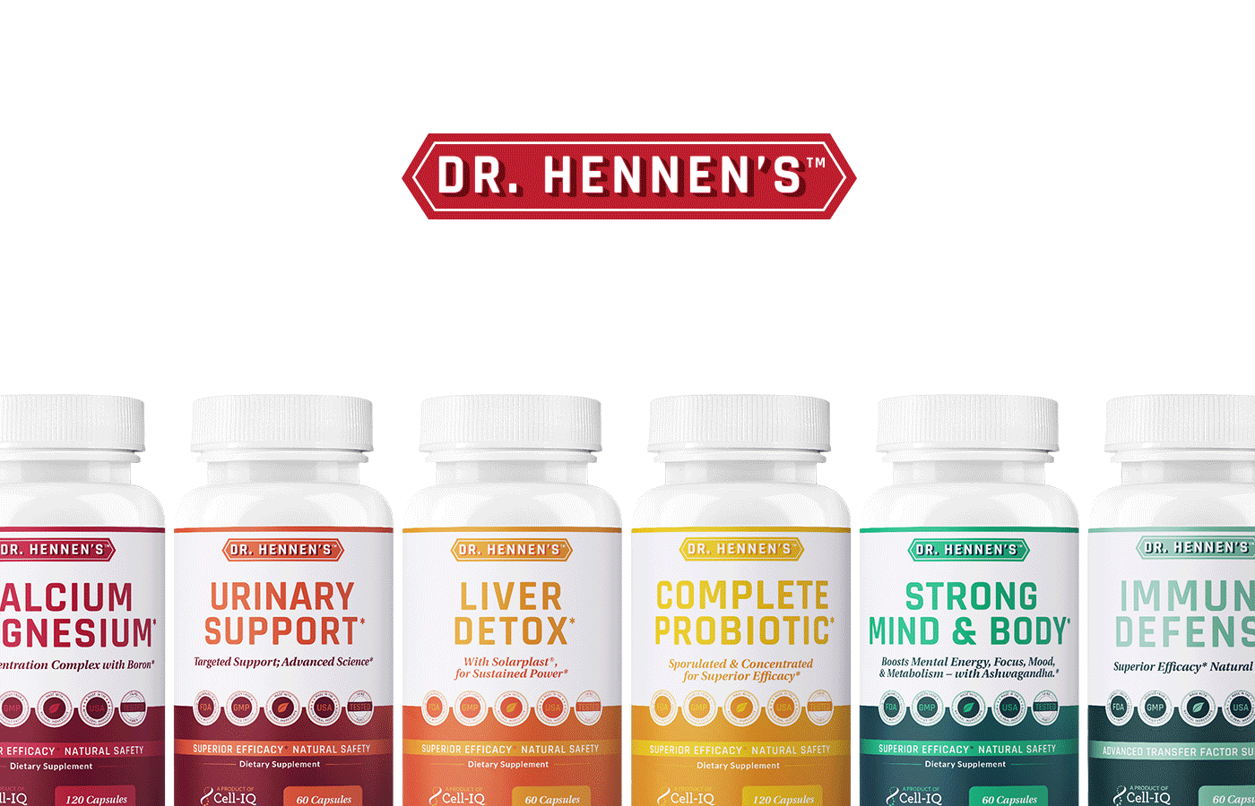
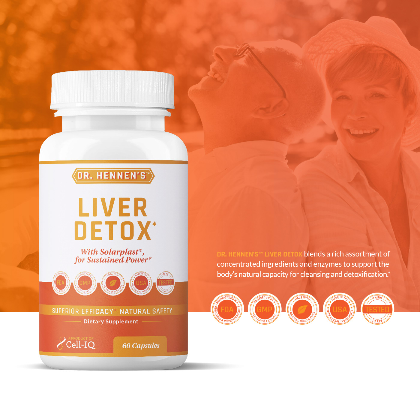
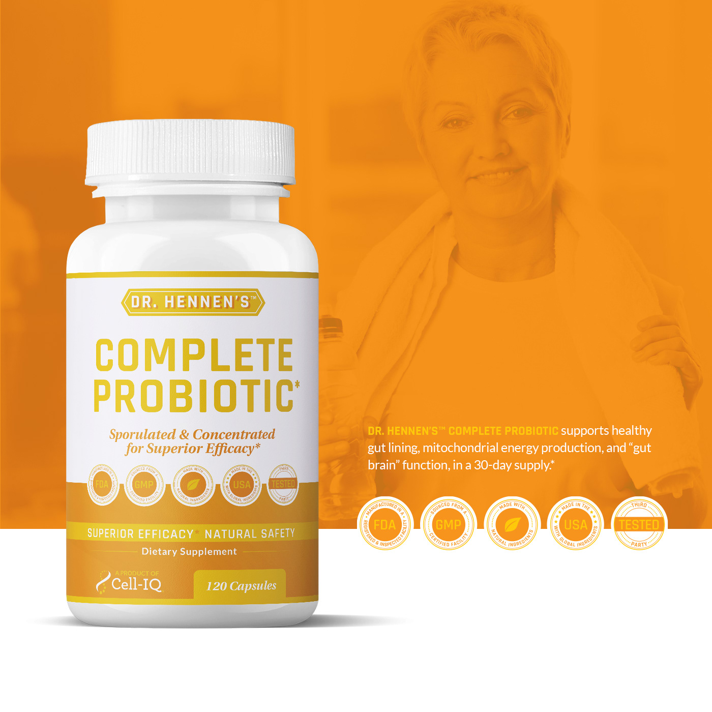
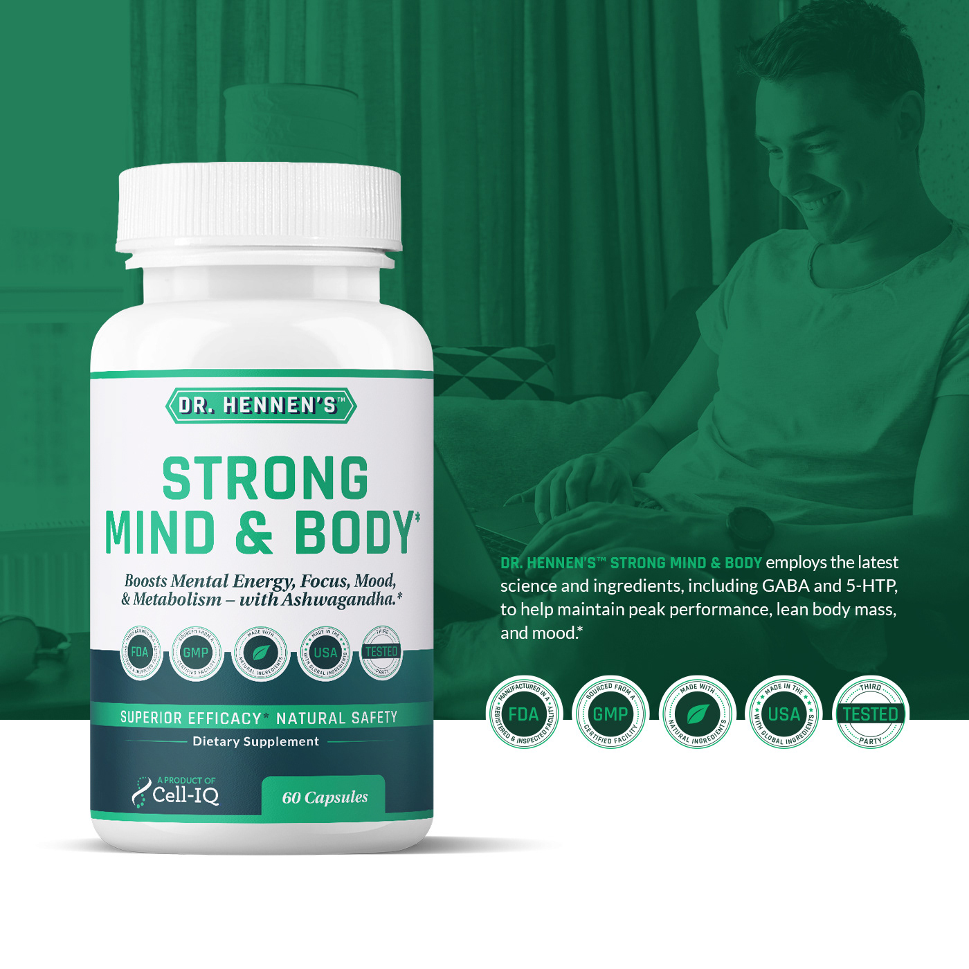
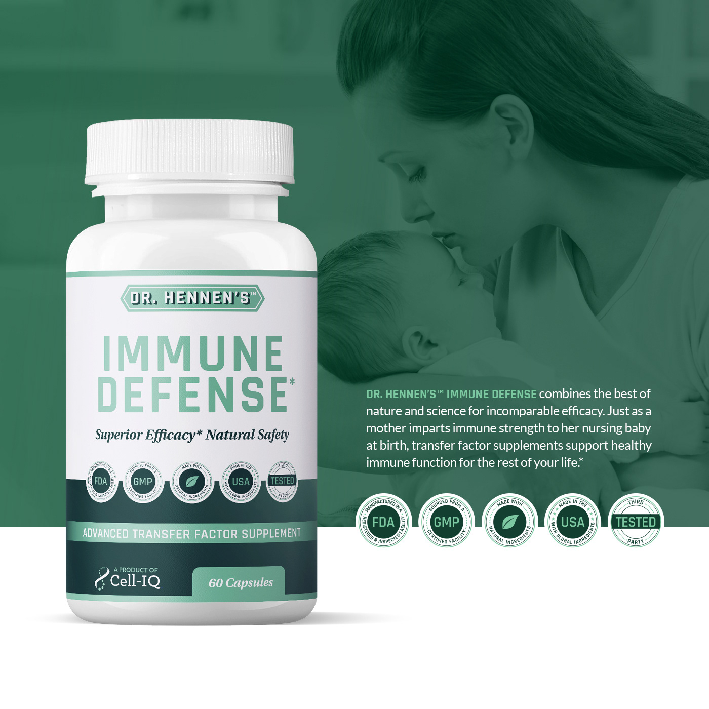
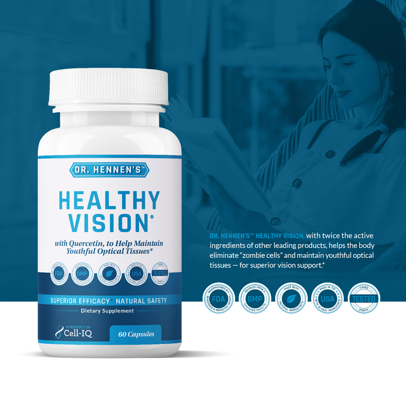
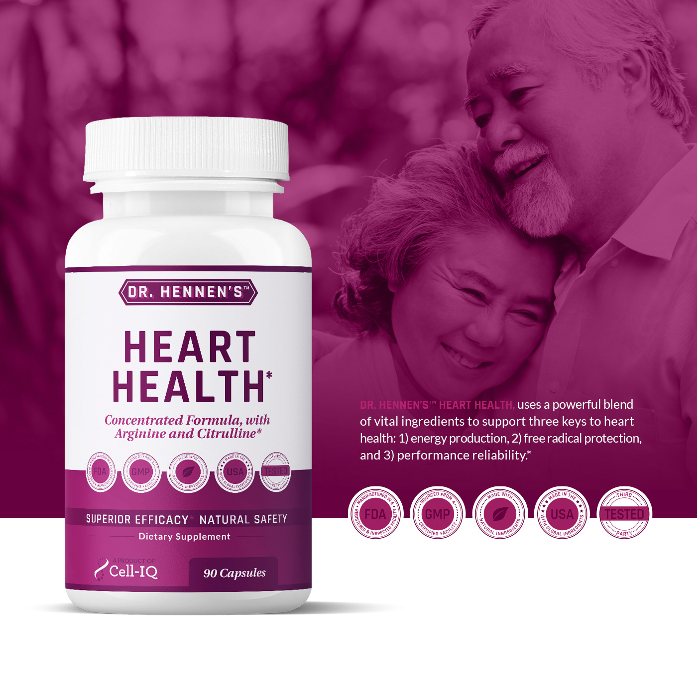
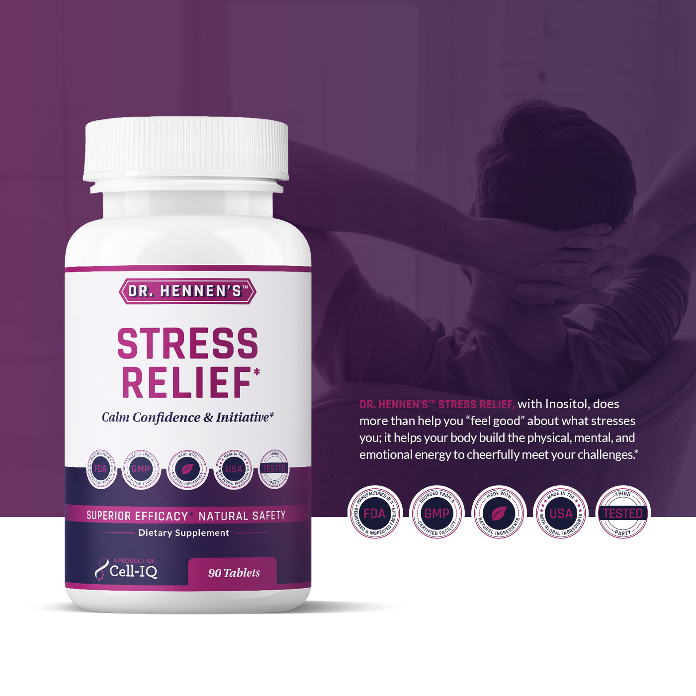
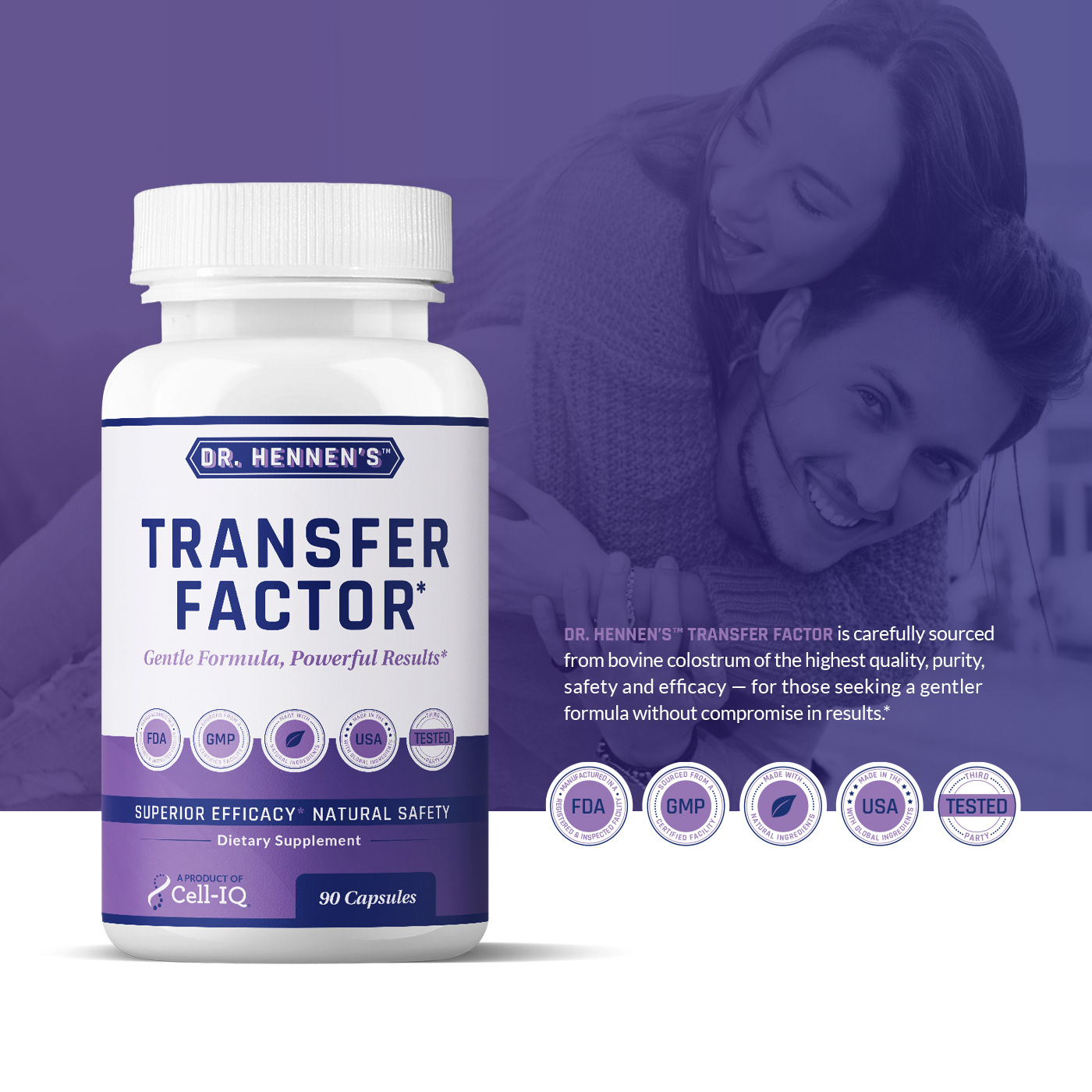
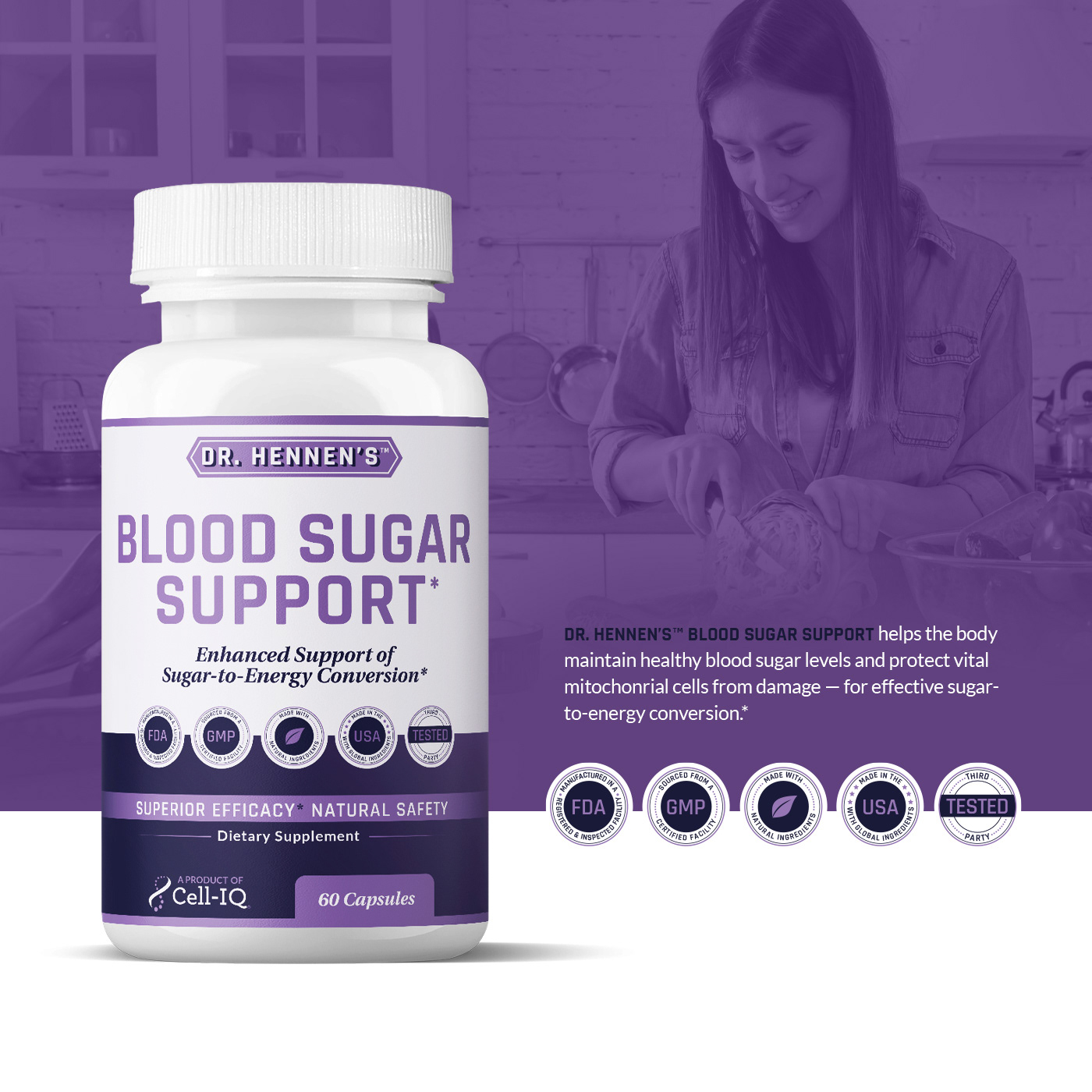
Summary: In the 2 years I have done work for them, I have had the joy of designing their packaging such as the 12 shown above. The rainbow color spectrum of the packaging is playfully based off of the nutritional fruits and veggies that give us our vitamins and minerals that our bodies need daily. The label design was also set up minimalistic and right to the point such as their brand callout, how many capsules it has, and the the type of product it is directed for. My approach as a portfolio piece was to layout areas that highlighted certain items that would show off the colorful brand's styling of their products.
Fonts used: Rajdhani, Heuristica, Lato.
Credits: Designed under Lettermuse Studio (Owner of Katrina Sutton) / Direction by Ben Pollock (COO) and Team (William Hennen, David Warren, Meredith Pond, and Scott Anderson).
Credits: Designed under Lettermuse Studio (Owner of Katrina Sutton) / Direction by Ben Pollock (COO) and Team (William Hennen, David Warren, Meredith Pond, and Scott Anderson).