


Book of Rhymes
August 2013 | Client (Romane Armand)
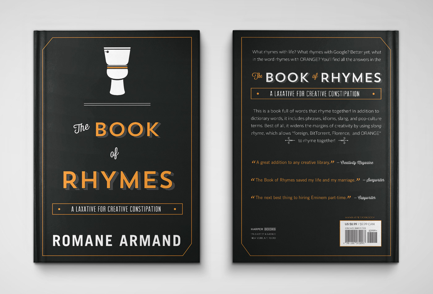
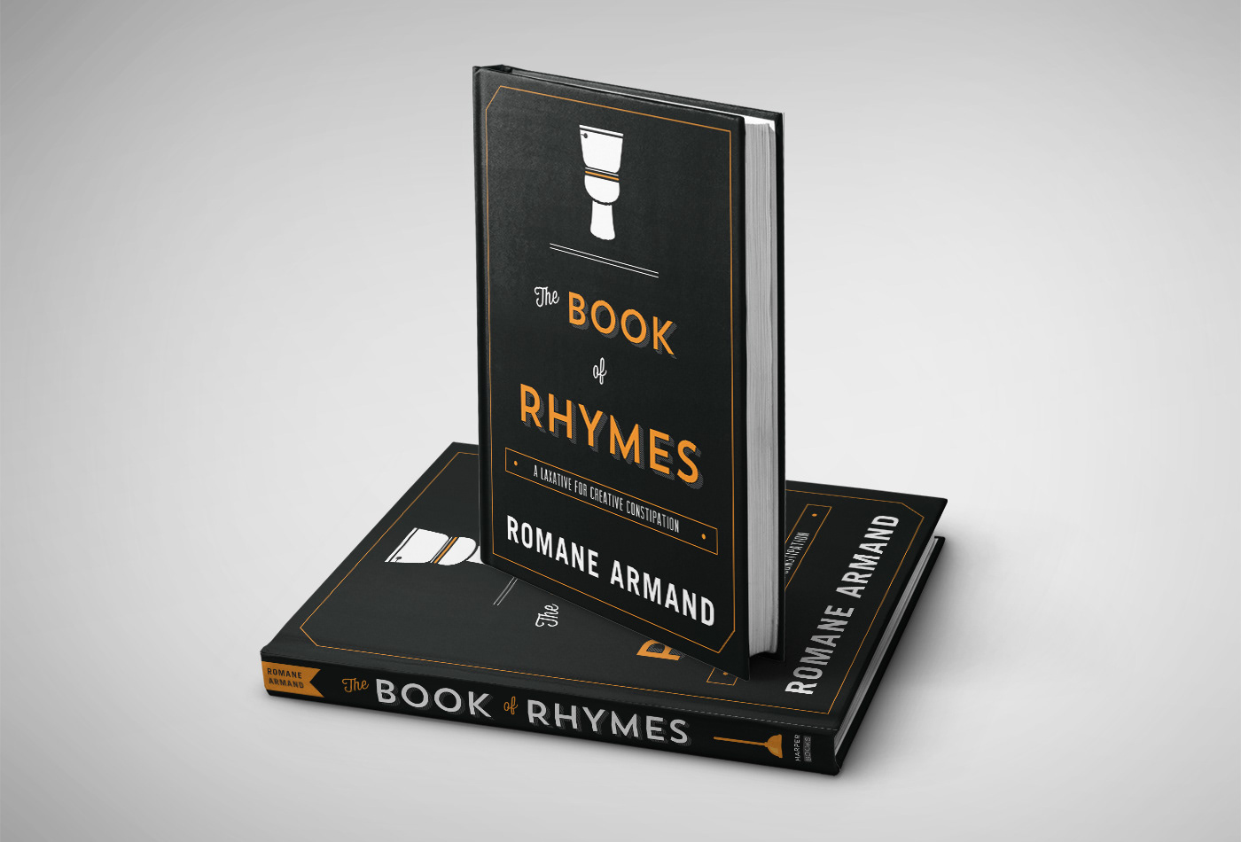
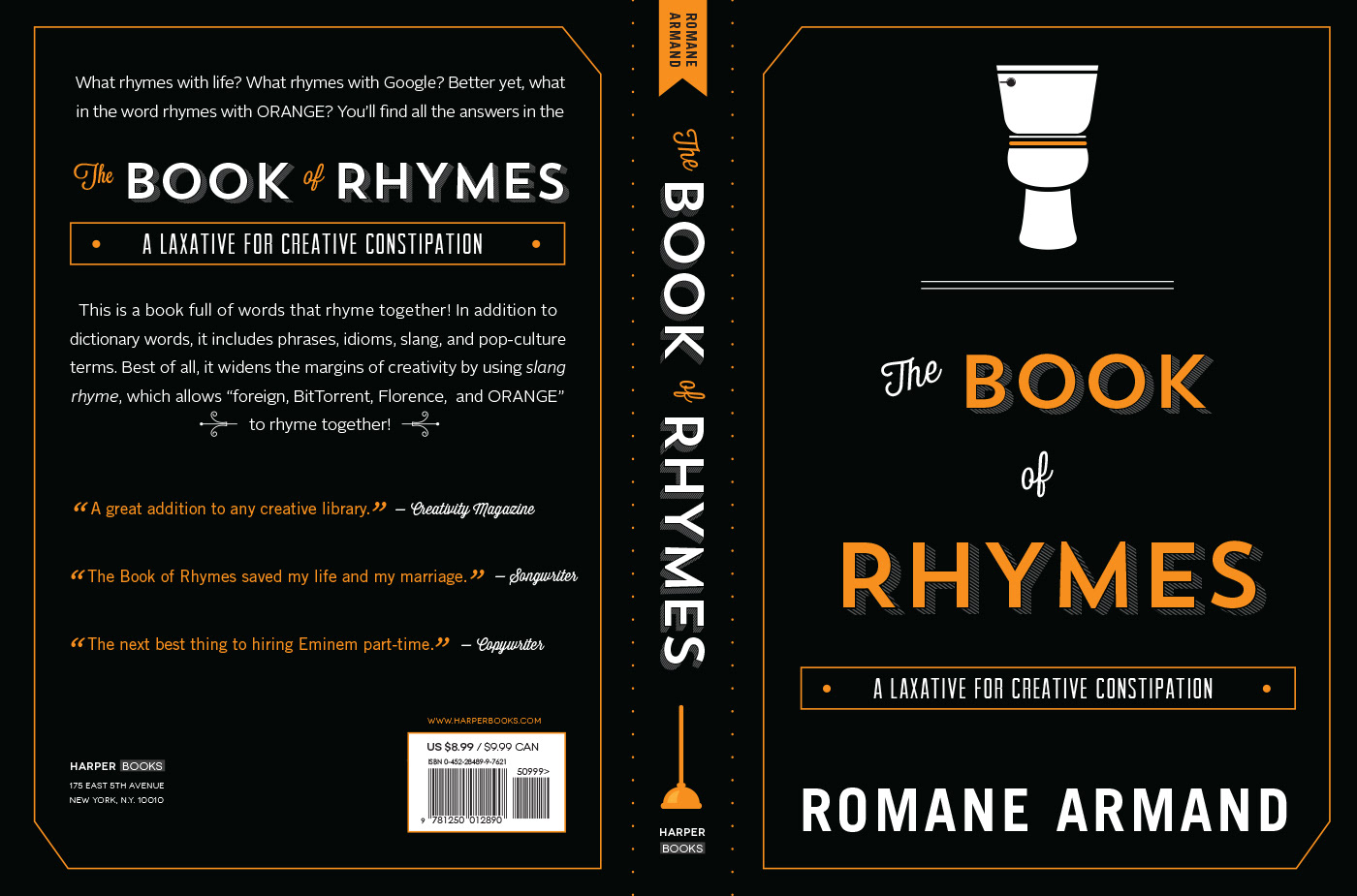
The client was looking for a minimalistic book cover design that emphasized on the main title in a way that would catch the buyer's eye by using pops of orange and an unique, but fun way of displaying visual elements that co-exist with the title of the book (plunger, toilet, etc.). After showing the client a few options, he choose the one shown in the mockups above. Even though it was a quick design due to a short deadline, I truly enjoyed the process.
fonts used: Trend Sans, Thirsty (light), Arvil Sans, Trade Gothic (bold), Alright Sans (light)
credit: Author (Romane Armand) | Weapon Agency