
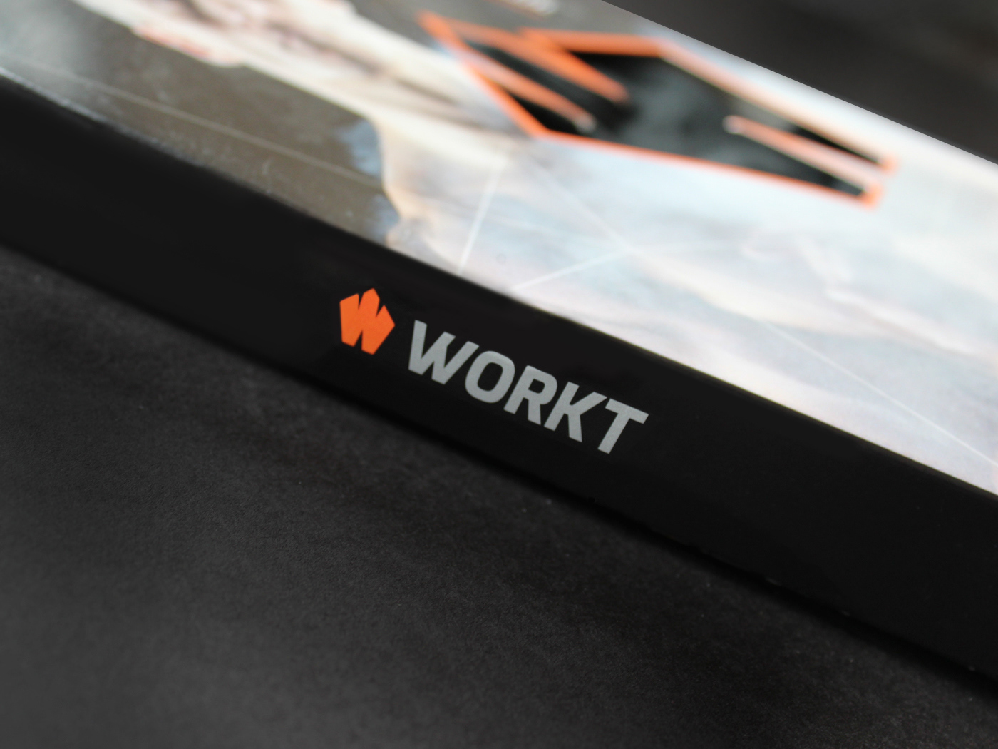


Workt Packaging Box
December 2013 | client (Workt)
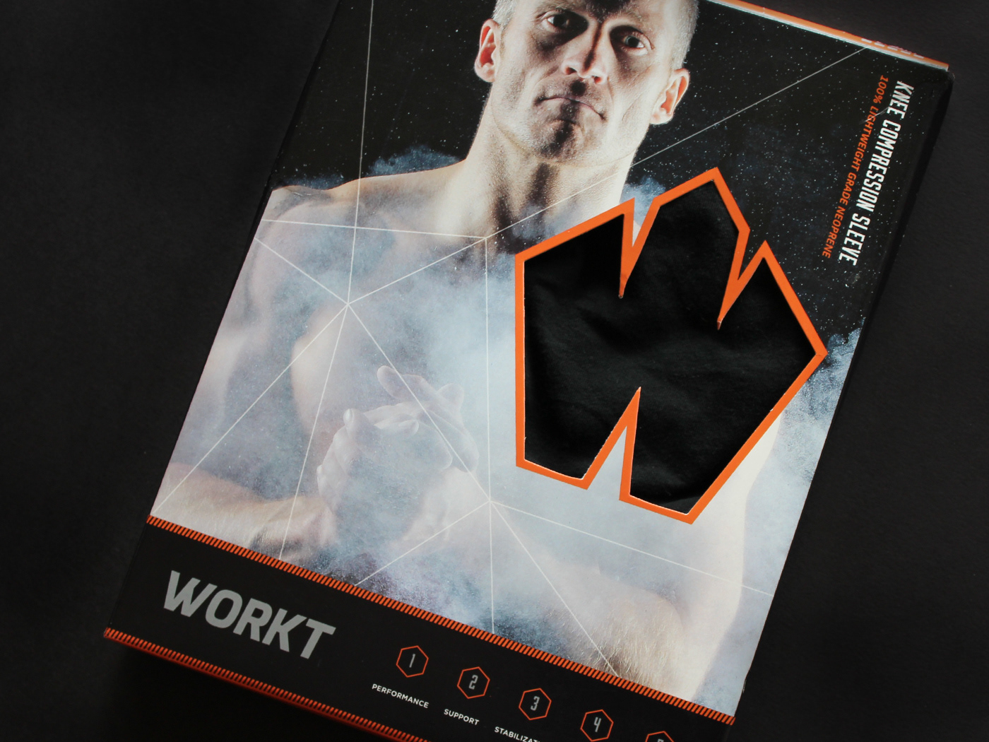
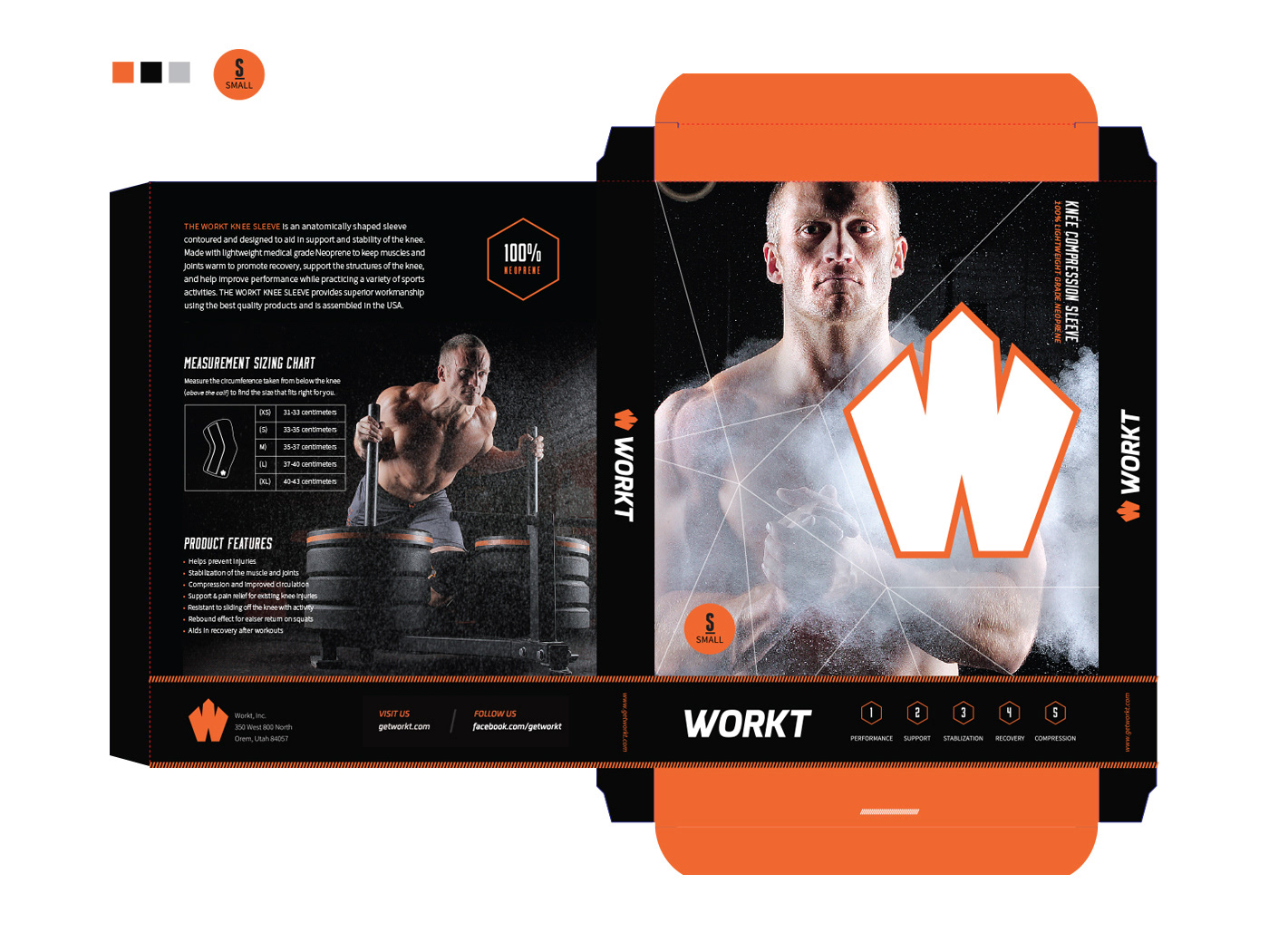
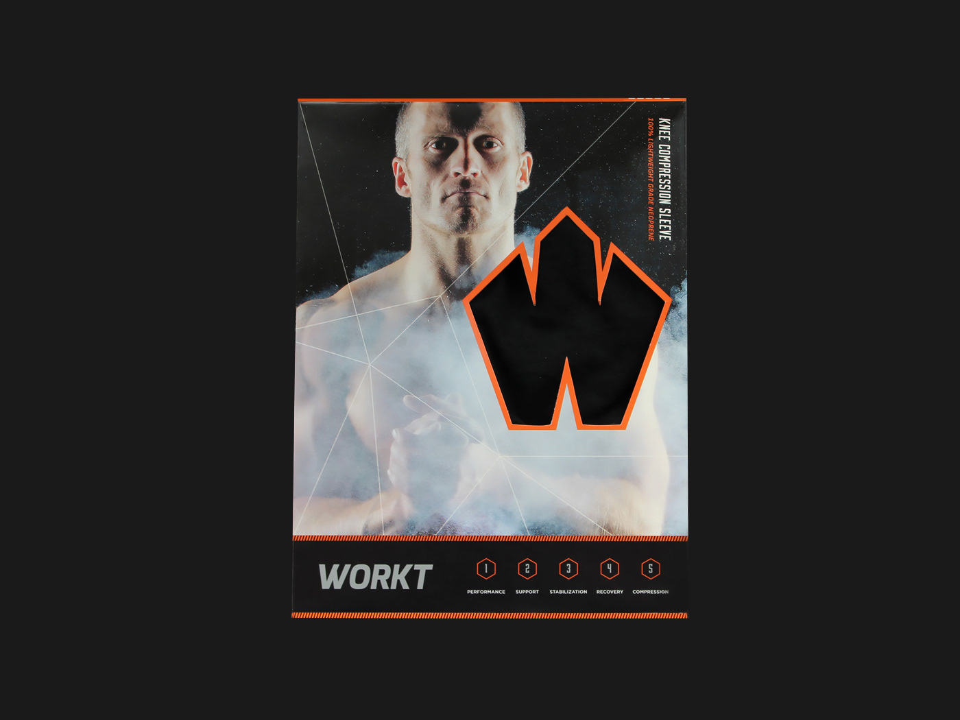
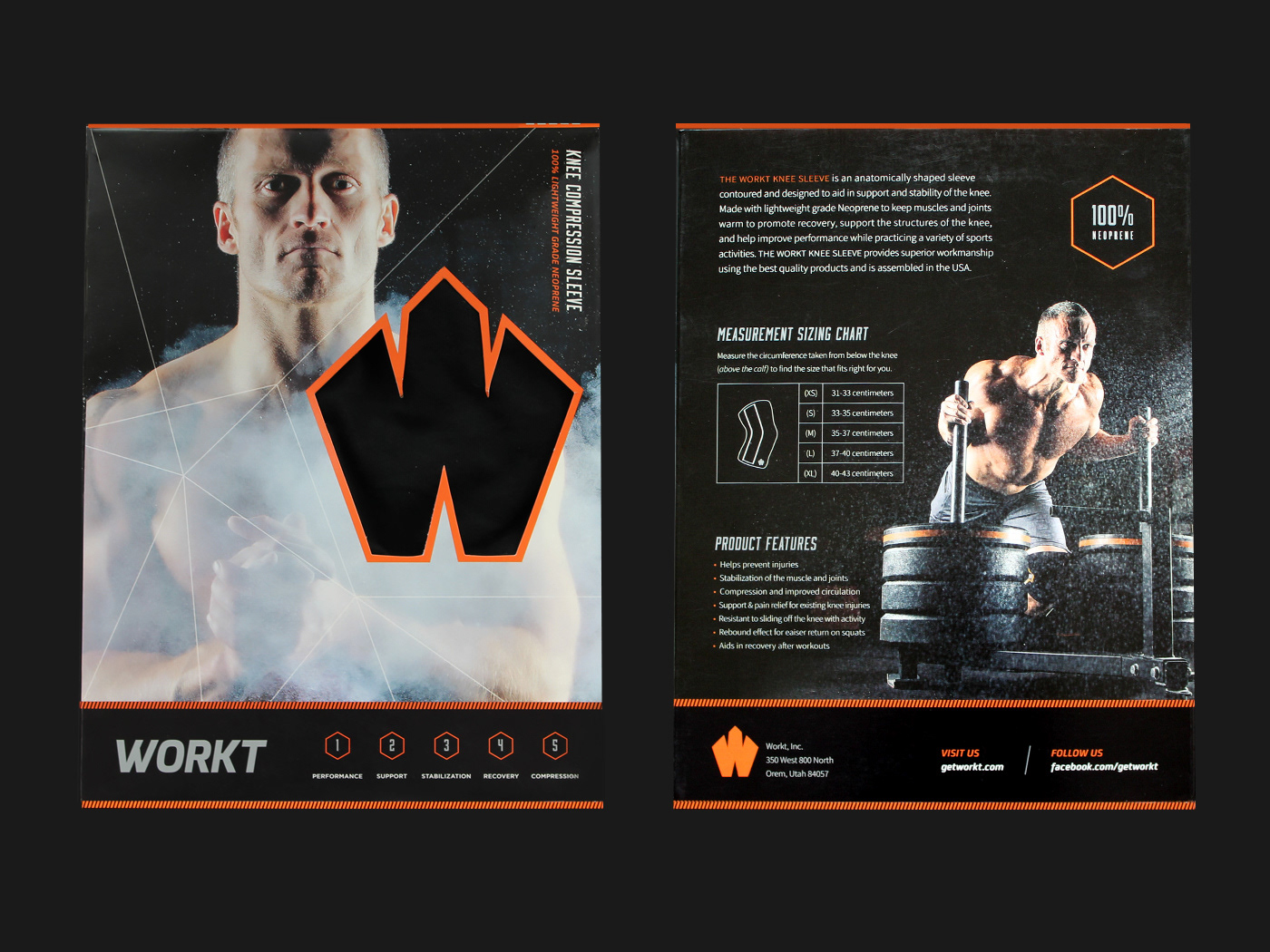
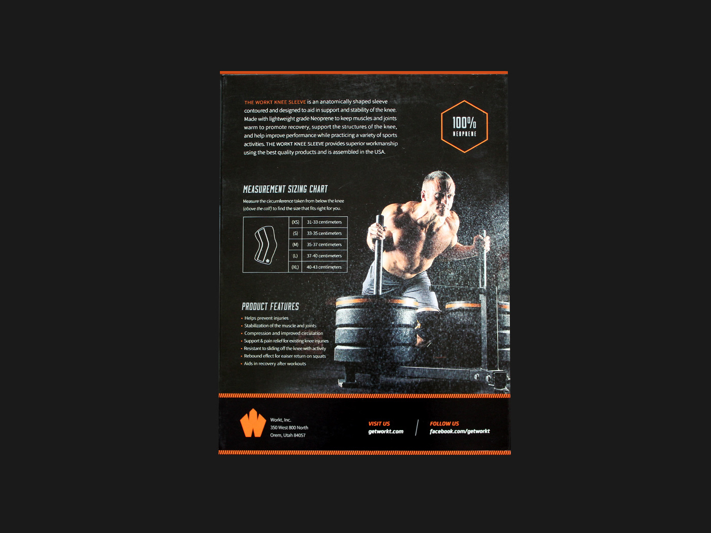
The client was looking for a new packaging box design that would hold his product (knee sleeve) in a more eye-catching way rather than using a generic shipping white box. In the front, with the main image, the "W" logomark in the front has a die-cut to show what the product looks and feels, a geometric line pattern that leads to the "W" opening, and a section that points out the features of what capabilities the knee sleeve has. On the back, with a smaller image that correlates with the front, the description, measurements, and features surrounds it letting the customer know what the product is all about. To top it off, using the hexagon shape, I created an emblem that says 100% neoprene to let the customer know what the product is made of.
fonts used: Source Sans Pro, Knockout, Moonshiner
materials used: Canon Rebel T5
credits: Logo (Chelsea Hoskins) | Model photography by Ash Ram | Model (Zach Ludlow) | Weapon Agency
materials used: Canon Rebel T5
credits: Logo (Chelsea Hoskins) | Model photography by Ash Ram | Model (Zach Ludlow) | Weapon Agency