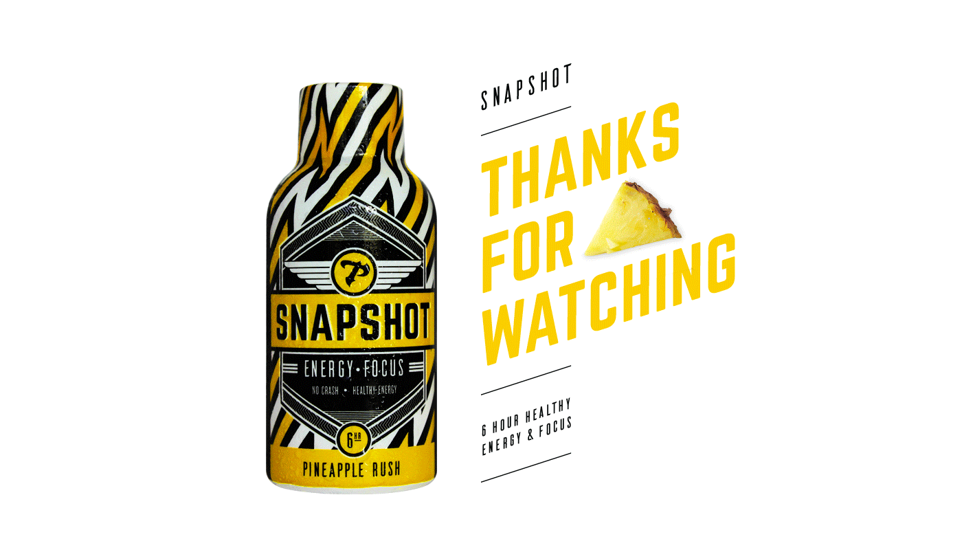

Snapshot Energy
2015 | client (Snapshot)
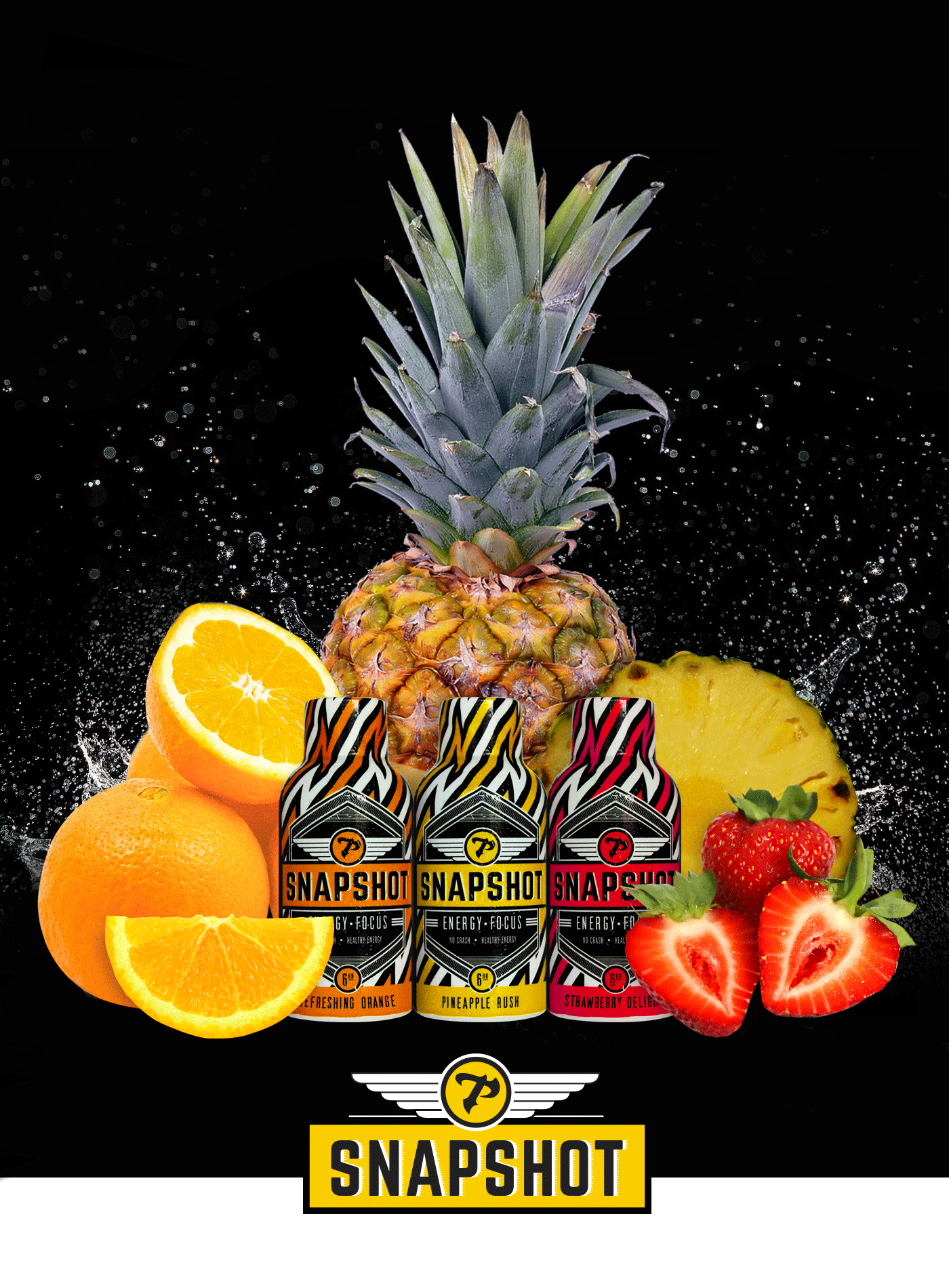
For a limited time, Snapshot Energy was directed at audiences that did or was interested in paintball. Proudly, I considered this one of my quick design processes as that I was only allotted to work on it for less than 8 hours between the bottle and box and I was able to get it done in that timeframe. The direction they were looking for was something that dictated fast lightning energy. So I came up with a lightning pattern for the background and a badge that included the name of the bottle, their "P" logomark that I put into a wing design and short easy words that were the main focus of the energy drink. The only flavor I got to do at the time was the Pineapple Rush. So I thought it would be a fun process to imagine that they had two other flavors, Strawberry Delight and Refreshing Orange (names I came up with). Excitedly, I was able to see the design printed on one bottle that was brought into the office. Sadly, since it was for a limited time, I never got to see the counter display box with multiple copies of the bottle. So I took up the challenge to mockup the items myself using my Canon Rebel T5, a Counter Display Box and the one bottle I actually have.
fonts used: Norwester, Ailerons, Skola Sans
materials used: Canon Rebel T5, Counter Display Box, Snapshot Bottle
credits: Weapon Agency
materials used: Canon Rebel T5, Counter Display Box, Snapshot Bottle
credits: Weapon Agency